Capturing Fight Night with hazy.film
Intro
This blog post is a walkthrough of me shooting and editing pictures from Fight Night at Trucks Access Park in December 2025. I’ve been meaning to write this up independently as part of hazy.film, and when I saw the call for content from Film My Soul, I knew I wanted to collab. The style of this post is less of a technical walkthrough, rather it’s largely just me describing my inner thought processes as I’m shooting and editing. All pictures were taken with my Fuji X10 and all edits were done on Adobe Lightroom mobile.
First glance
The event took place around an outdoor ring and started at 5pm during summer, so there was plenty of time for good light before the sun went down. I shot on auto EXR with flash pretty much the entire evening. Before sunset, the light hitting the ring was decent and I ended up capturing shots with no motion blur and vibrant colours:
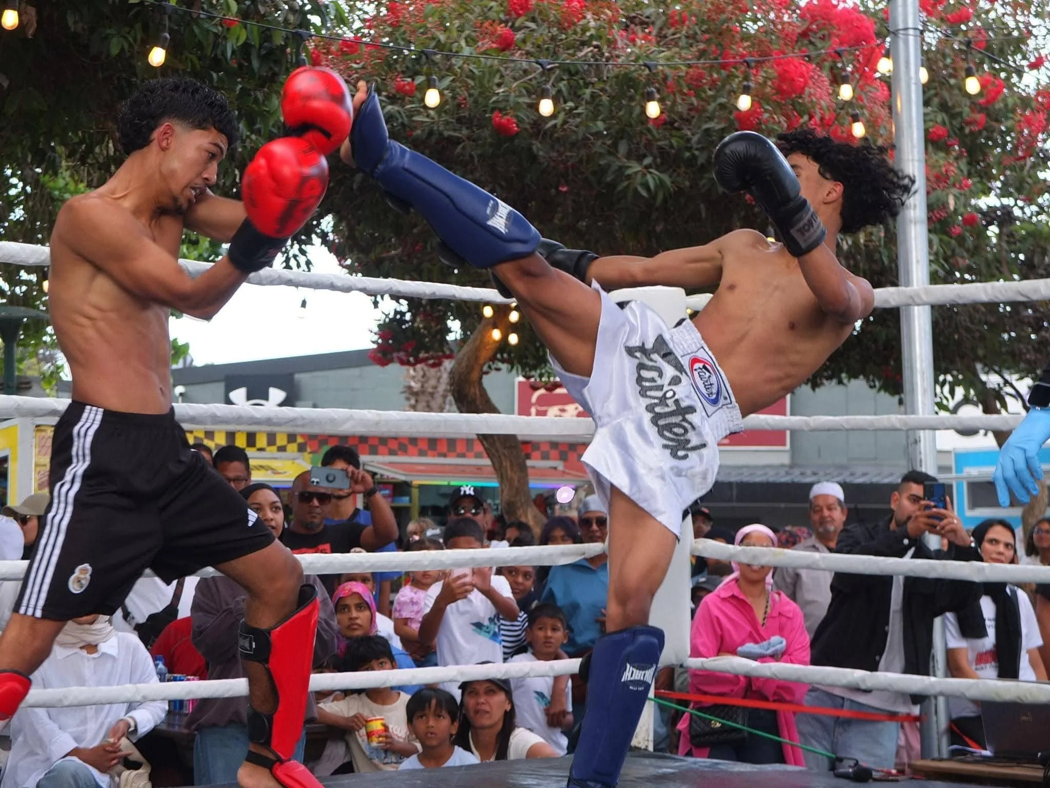
After sunset things started getting darker and the ring was lit with artificial light. The resulting pictures had a lot of motion blur and more blown out highlights:
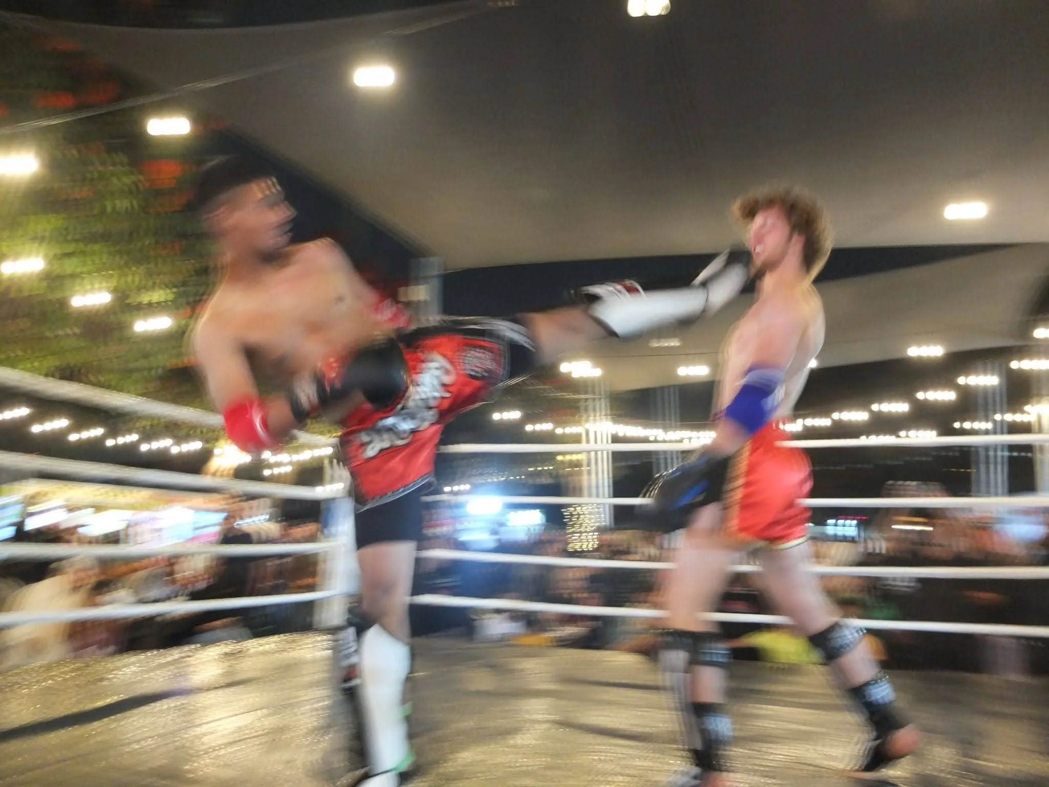
I saw the blurred pics as I was shooting but didn’t bother to use shutter priority mode to fix it since I figured I had enough stills from earlier, and I was getting tired of shooting (I wasn’t commissioned to be there, I was just shooting for fun). Initially, I wasn’t super happy with the results since the pre-sunset stills didn’t convey the energy of the ring while the post-sunset pics were a bit too blurry for my liking. But after sitting on the pics for a few days and some experimenting with editing I saw these pics have some potential to be cool.
Inspiration
I don’t have an exact style in mind for any of my pictures before going into editing, but I do have a loose set of references that I occasionally look back on. Part of these references come from y2k aesthetics,dreamcore, vaporwave, gen x soft club, low poly aesthetics, etc. In this case, I drew some inspiration from retro PS1-style fighting games such as Tekken 3, Street Fighter, and Mortal Kombat. This included in-game graphics as well as cover art. The main picture this blog post is centered around is the following picture:
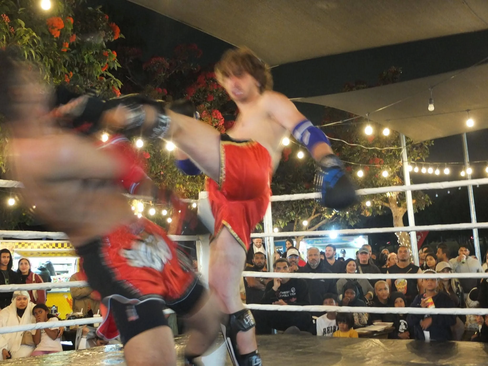
Very quickly we can see that this matches the vibe of retro fighting games:
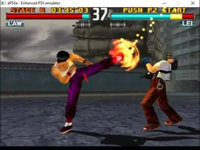
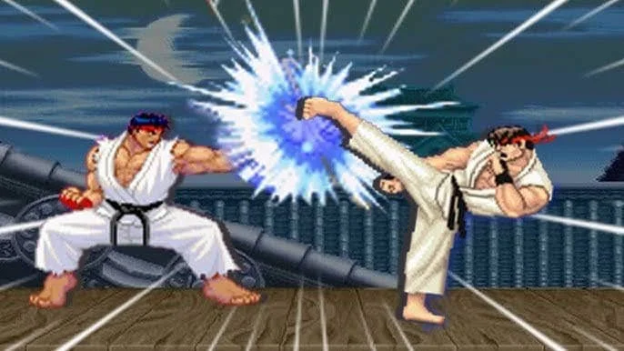
In hindsight, it seems silly to be surprised that I’d find such close matches to my fighting pictures since video games are a simulation of the real thing, and not the other way around.
Editing with Lightroom mobile
Editing the main roundhouse kick picture was done in 3 steps, all on Lightroom mobile. Each picture in the Instagram carousel was done differently, but the ideas overlap.
Cropping
When I post on Instagram I usually use a 3:4 aspect ratio, otherwise I’ll use a 4:5 crop. The upside of cropping is that I have more wiggle room to move the subject if I didn’t nail the composition as I shot it, which happens more often than not in a fast-paced setting like this outdoor fight. Moreover, the large vertical crop matches the natural orientation of the phone, so seeing the picture fill your screen as you open Instagram makes it look more dramatic imo.
In this case, I went with the crop on the right since it emphasises the power of the fighter kicking his opponent ‘out’ of the screen:
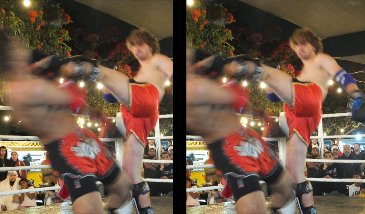
Alongside the crop I also typically border my images. In this case, I decided against it since I like the effect of the fighter kicking his opponent outside of the frame, making the kick seem extra powerful. This crop also allowed me to centre the fighter and cut out some of the motion blur from his opponent.
Masking
Masking is the process of isolating components of an image by a certain property. For example, you could mask parts of an image that correspond to a certain colour, or isolate just the subject. Lightroom has a great selection of different masking tools you can use, including automatic detection of subject/skies/background and more. In this case, I wanted to mask the subjects (both fighters) away from the background so I could colour grade them differently. Even with slow shutter pictures, the subject mask works well enough:
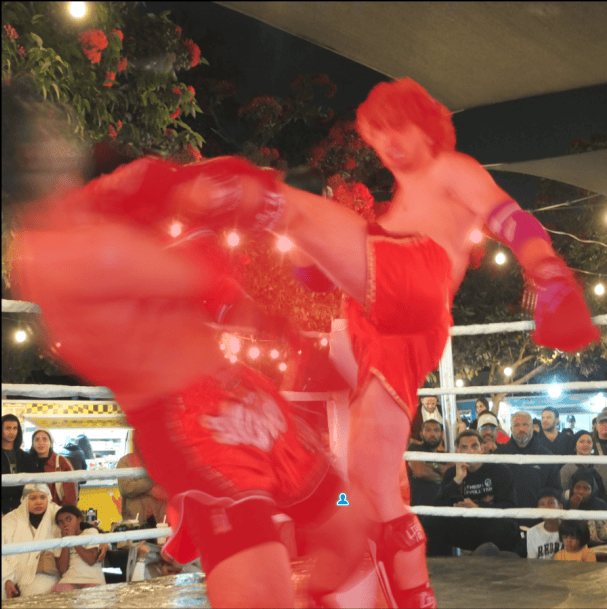
The only addition I needed was to brush in the mask of the opponent getting kicked, but otherwise I thought it was good enough. I also didn’t brush out the background in the middle of the mask, mostly because I try to avoid being a perfectionist.
Colour grading
I generally spend a lot of time colour grading to get a specific feel out of the image, more than trying to achieve realistic colours. Typically this means clicking around with the colour grading wheels and just messing with the temperature, tint and saturation of the image and/or masks of the picture to get to some vibe. This sounds unspecific, because it mostly is. When I think about the colours I want, I try to convey what I felt at the time I took the picture, or at least how I interpret it looking back. This might mean I colour grade sunsets missions with friends to feel warm and dreamy, whereas pictures I took while solo might be more blue and intentionally dull if I felt more isolated. Of course, this is not a hard rule and just something I’ve noticed over time about my editing style as it developed.
In this case, I was inspired to colour grade these fighting pictures to match the over saturated colours of low-poly PlayStation 1 fighting video games. Of all the colour grading tools used, the tone curves were by far the most useful. Tone curves provide a more precise control across overall tonal range and red, green, blue colour components. From left to right you’re able to control the deepest shadows (blacks), to shadows, midtones, highlights and then the brightest highlights (whites). All pixels are also made up of some combination of red, green and blue and the curves allow you to adjust the amount of each component granularly.
I aimed to have a cooler background to contrast the subject that has warmer vibrant, almost over-saturated colours. Since the subject was a bright part of the image, I needed to adjust the blue channel curve upwards so that the shadows + midtones have more blue, as seen in the curve below:
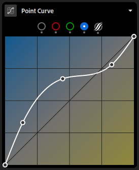
I ended up desaturating and dropping the clarity of the background mask as well just to push it back even further against the subject.
For the fighters, I increased the red and green highlights on their curves to brighten the respective colours. I also increased the saturation on just the masked fighters to get that almost gimmicky-yet-vibrant video game colours. The last steps were just to experiment with effects like the texture slider and dehazing. This was helpful to make the slow shutter effect on the fighters look a bit grainier, mimicking a slightly pixelated look you might see in old/low-poly video games.
These are the tone curves I landed up with:
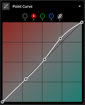
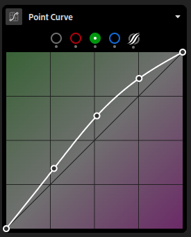
Since things were quite over saturated, I selectively desaturated yellow, cyan and blue on the colour mixer. Selective desaturating is something I do often in my editing, especially with film pictures. This is so I can land up with very vibrant colours but not have it be oversaturated globally, which is usually what happens with just slapping on a filter from Instagram or anywhere else.
Outcome
After all the editing laid out above, bar a few tiny tweaks, we’re left with the final pic :)
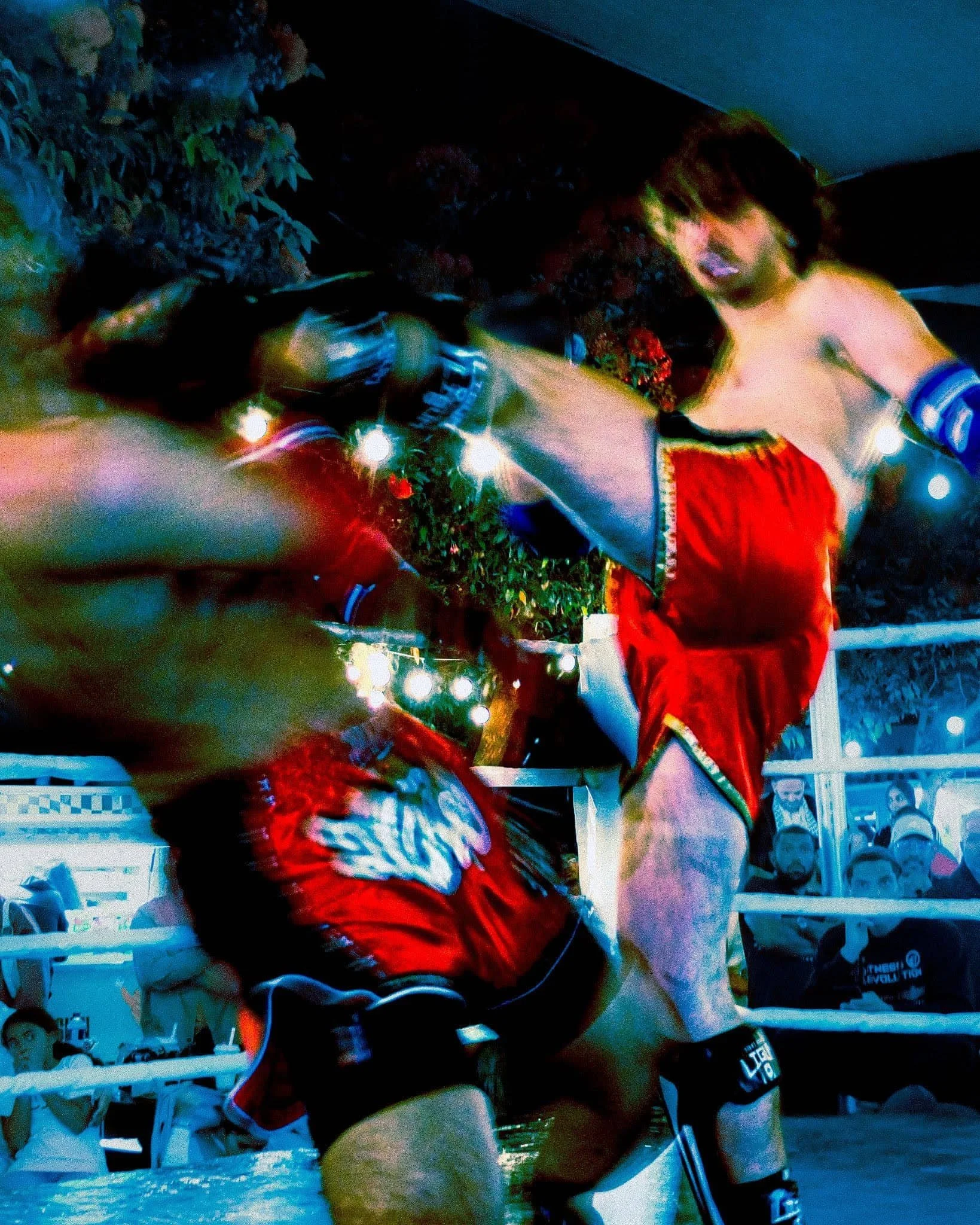
Overall I’m really happy with the outcome, and I learnt a lot in the process. This was my first time using tone curves without any expectation, and I’ve used it in almost every edit since then. I hope you enjoyed this post and hopefully feel compelled to experiment with your edits as well!